

How To Create Your Own Substack Wordmark
Follow this proven, stress-free design guide


A Wordmark is simply a type of logo that consists purely of text.
In Substack, it is displayed in the header at the top of your Newsletter website (for example at the top of this page).
You have two options, the default is to use your publication name or upload an image in place of the regular web font Substack would show.
The first option is easy, you don’t have to do anything, and Substack will do it for you automatically.
The second option, however, has proven quite challenging. While Substack does provide info on the specification, the reality is far from trivial.
In fact, rumour has it that it’s been driving Substackers mad!
Well, fret not! You don’t need to lose your mind because, after much trial and error, I finally cracked it.
As you can see, my Wordmark doesn’t look ‘too bad’.
Do you know that Substack Notes Analytics is here? Read the complete guide here.


First things first
You need to remember that a Wordmark is a ‘text only’ logo!
It is best if you don’t use any picture/symbol/drawing or anything like that if it’s not part of the text design.
This type of logo belongs to the ‘Publication Logo’, the one that is displayed at the top-left corner of the page.
It won’t work if you put a background (of any shape or form) behind the text.
If you have any of the above, your wordmark will appear small.
So what works?
You can use any graphic design tool that you are comfortable with.
I used Canva to create mine.
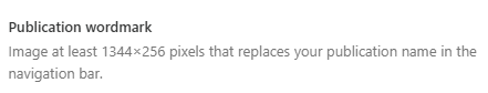
Stick to the dimension ratio of 21:4.
Notice that the recommended dimension, i.e. 1344x256 has a ratio of 21:4.
After examining the underlying Style Sheet of the web page, I concluded that the maximum height of the displayed image is 40px, which means even if you have an image with a height of 256 or 400, it will be resized to somewhere below 40px.
In general, sticking to the recommended dimension should be fine.
But I recommend to start with 2100x400 to give you room to play with.
Fill the entire dimension with text.
To get the maximum size of the wordmark, you need to fill the whole template with your text.
Resize it until it touches the 4 edges - try not to give any white space around it.
Yes, it will also depend on the type of font that you choose to use.
For example, here is how tight I resized mine.

Notice that I use only a white background, and my red swift symbol is part of the text design.
Save as a Transparent PNG!
This is a very important step! You need to save the design in a PNG format AND you need to turn on transparency.
In Canva this is very simple to do:

DONE!
Perfect! Now you have your Wordmark!
If after following this guide you are still struggling, ping me in the comment or PM me. I will do my best to help.
I am a Graphic Designer and trying to make this wordmark made me question my life's choices! Thank you!!
I did not realise you could scale the size. Thanks for sharing.